
 SDN BHD")


How Fashion Stores Can Create a Premium Look Through Signboard Design: A Complete Guide to Branding & Customer Attraction
In Malaysia's competitive fashion retail market—especially in Kuala Lumpur, Selangor, Penang, and Johor Bahru—the decision for customers to enter a store is often made within seconds based on first visual impression. The key factor influencing that decision is not price, but the shop signboard design and storefront visual presentation.
A fashion store signboard is not just an identification tool—it is a core branding asset that shapes your brand image, perceived value, and customer walk-in rate.
What is "Premium Look" in Fashion Store Design?
A "premium look" does not simply mean expensive materials. Instead, it is about creating a strong sense of brand trust through visual presentation. At its core, premium design comes from careful control of details and overall visual consistency.
A truly premium-looking fashion store usually reflects: Quality perception, Brand style consistency, Trust & credibility.
Core concept: Minimalism + Consistency + Refinement
Key Principles of Fashion Store Signboard Design
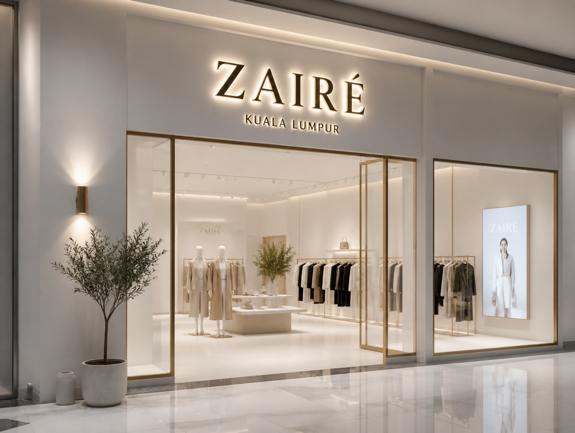
1. Simplicity First (Less is More)
High-end brands share one common trait: the less information, the stronger the brand impact.
Recommended: Brand name (main visual focus) and short slogan (optional). Avoid: Excessive promotions and long complicated text descriptions.
Less clutter creates clearer branding and a more premium visual impression.
2. Typography Defines Brand Identity
Fonts directly influence how customers perceive your brand at first glance:
- Sans Serif → Modern, trendy (common in KL street fashion stores)
- Serif → Elegant, luxury, high-end boutique style
- Script → Creative, niche, designer brands
Use clean, readable fonts that match your brand identity consistently.
3. Color Defines Perceived Value
Common premium color combinations in fashion retail:
- Black + White → Minimalist and timeless luxury
- Beige + Gold → Soft luxury and warmth
- Grey + White → Modern and clean aesthetic
- Dark Green + Gold → Premium vintage style
Avoid: Highly saturated contrasting colors, too many mixed colors, neon or "cheap-looking" bright tones.
The more restrained the color palette, the more premium the brand feels.
Signboard Material Selection
1. Acrylic Letters
Clean and modern appearance, most commonly used in KL & Selangor. Can be made with or without lighting. Best for: Trendy brands / fast fashion stores.
2. Stainless Steel Letters
Strong premium and luxury feel, common in JB and high-end commercial areas. Available in mirror finish or brushed metal styles. Best for: Luxury brands / boutique fashion stores.
3. Lightbox Signage
Even and consistent lighting, common in shopping malls (e.g., Mid Valley, Pavilion KL). Strong and stable brand visibility.
Key principle: Material consistency > expensive materials
Lighting Design
Lighting plays a key role in defining whether a store looks premium or not.
Recommended: Halo Lighting (backlit glow letters), Warm White lighting, hidden light sources for a clean finish.
Avoid: Overly bright LED lighting, multi-colour neon lights, flashing or dynamic lighting effects.
Lighting should highlight the brand, not overpower it.
Fashion Store Signboard Design Formula
Brand Name (main visual) + Logo (optional) + Negative Space (white space)
Example: "LUMIÈRE" Black background + illuminated lettering + large areas of empty space
The more white space you use, the more premium the design feels.
Common Mistakes (Made by 90% of Store Owners)
- Too much information like an advertisement board
- Inconsistent or messy typography
- Overuse of colors
- Lighting that is too bright, reducing premium feel
- Mixed or inconsistent material styles
3 Advanced Techniques to Enhance a Premium Look
Technique 1: White Space Design — Improves visual breathing room and creates a stronger sense of brand hierarchy.
Technique 2: Brand Consistency — Ensure the signboard, storefront, and interior design follow the same visual identity.
Technique 3: Lighting Balance (Light Control) — Low-key but clear visibility = the standard of a premium brand.
Summary: Premium Signboard Design Comes from "Visual Restraint"
A successful fashion store signboard is not built on complexity, but on controlled and consistent visual expression: simple (not complicated), consistent (not messy), clear (not harsh or glaring), and stylish (not exaggerated).
FAQ
1. Do fashion stores need illuminated signboards?
Not necessarily. High-end brands focus more on texture and lighting control rather than brightness. A subtle, well-balanced lighting design often feels more premium than strong illumination.
2. What colors make a fashion store signboard look more premium in Malaysia?
Common premium color choices include black, white, grey, beige, and dark green. These low-saturation tones help create a more elegant, modern, and high-end brand image.
3. Is there a difference between mall stores and street-level store signboards?
Yes. Mall stores usually focus on clean, refined, and consistent branding, while street-level stores need stronger contrast and higher visibility to attract attention from a distance.
4. How can I create a premium look with a limited budget?
Focus on typography, color selection, and spacing. A well-designed layout with good visual balance often looks more premium than expensive materials.
5. How often should a fashion store signboard be updated?
Typically every 3–5 years, or whenever the brand undergoes a visual identity upgrade or repositioning.
Call / WhatsApp Us: 012-588 3533 Website: signboardkajang.com
Disclaimer: Information provided is for reference only. We do not bear responsibility for any inaccuracies or consequences arising from its use.